
At Monarch, we preach that creating a stable foundation for your online presence is crucial. This all starts with creating a landing page – focused on content, design, and conversion optimization. At the end of the day we are focused on crafting a landing page that will drive crazy amounts of qualified traffic. In turn, lowering your CPA (cost-per-acquisition) and ultimately increasing your conversions.
Here is a guide to drive crazy traffic and cash right to your door 🚀
Let’s start simple – what is a landing page?
Simply put, a landing page is a web page focused on a product or service that is designed to convert website visits into conversions. The ultimate goal of a landing page is to drive the highest amounts of “conversion-worthy” traffic, while at the same time implementing strategic CTAs (call to actions) to collect information and data about your audience.
There are several different types of landing pages. With that said, from a paid media perspective we typically see one of two types: lead generation landing pages and click-through landing pages. Historically, a lead generation landing page is focused on field and data collection. Whereas, a click-through landing page is focused on physical transactions or purchases.
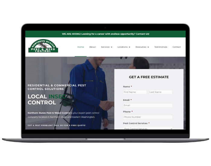
The breakdown of lead generation landing page:
The key components of a lead generation focused landing page are: design, CTAs (call to actions), form clarity / layout, testimonials, and offer benefits.
Design
Design and content are crucial to landing page development. At the end of the day, you must have a captivating design that is clear and understandable for everyone. Here are some tips:
- Differentiate content in clusters throughout the page
- Use shapes and symmetry
- Keep content and colors consistent
- Use visuals focused on the purpose of the page
Call to Actions (CTAs)
Strategic call to actions are typically illustrated in a link / button format with a command or action phrase, such as “Sign Up” or “Purchase”. A call to action is key to a landing page because it highlights the main point of that particular page (i.e. sales page, lead page, thank you page, etc.). Additionally, the call to actions are set to mitigate the amount of friction that may arise in the sales pipeline. Often times, it is preferred to have multiple CTAs so the message is crystal clear to the potential lead / buy prospect.
The call to actions that show up on your landing page should always match the context of your landing page. Typically, you also want your CTAs to math the design of your landing page (make sure your design team and strategy team are on the same page).
Here are some CTA examples that you might see:
- Buy now
- Add to wishlist
- Checkout
- Free Trial
- Sign up now
- Get started
- Sign up for our newsletter
- Read more
- Download now
Form Clarity and Layout
While a form is technically a call to action, it is important to highlight them as individual elements on a landing page. As you may know, forms are the most important part of any landing page. In turn, the way you craft your form is crucial for capturing information / leads. The design of a form is literally a balancing act. You can’t ask for too much 😜 but you can’t ask for too little either. So, how do you ask for just enough to where you and the lead / prospect benefit? Well here are some basic “rules” for format development and design. Please keep in mind that these can change on a case to case basis.
- Only ask for information that you need
- Let your form breathe – some space is okay
- Craft your CTAs strategically
- Use directional guides / cues (physcology of the mind 🧐)
- Test EVERYTHING you do
- Don’t forget about mobile – it’s crucial (make your landing page mobile first, trust me!)
Testimonials and/or Reviews
It seems like everything in marketing is a balancing act. The same is true for testimonials. While testimonials are a sure-fire way to build trust and loyalty with your audience, there is still a balance.
Showing reviews and/or comments made by other customers is a great way to provide relatable content to your prospect customers. With that said, it is important to showcase those reviews / comments in a “natural” way. Don’t be forceful or pushy – it might scare your prospects away 🏃. Additionally, make sure you are being truthful with your reviews / comments (please). Fake or edited reviews drop your credibility instantly (DO EDIT spelling / grammar errors). However, do showcase your BEST reviews – we love 5 stars 🌟🌟🌟🌟🌟!
Offer Benefits
Here lies the big question – what sets you apart from the competition? 🤔
Well, hopefully you have a product or service that is 1,000,000x better. But how do you effectively market that? You can’t just go out and say “Company X (your company) is 1,000,000x better than Company Y”.
Well….. not quite!
What we can do is market effectively, provide outstanding customer service, and highlight the benefits of your company/product/service. Offer benefits provide your company with a great way to capture qualified prospects. I mean, who doesn’t want FREE? Think of offer benefits as the same thing as your “company benefits” (i.e. PTO, health insurance, life insurance, retirement plan, etc.). Here are some examples:
- Sign up and SAVE $50.00
- Purchase today and get FREE shipping
- Claim your FREE eBook
You get the idea! If you don’t – Monarch is here to help you out!
Let’s CRUSH 2020 together!